Case Study / 2026
Bundle Shopping experience at Spectrum
Duration
2026 - Ongoing
Role
Senior UX Designer
Team
PM, Design, Engineering, UX Researchers (2)
Tools
Figma, KPI Analytics, Prototyping, Kiro AI, Claude Pro
Overview
A comparison-first packages experience shaped by funnel data, competitive research, and a clearer decision model.
The Problem
Shoppers were interested. The page just never helped them choose.
Find your perfect bundle treated bundle shopping as one decision when it is really five: Internet speed, mobile line count, TV tier, price trade-offs, and savings. Shoppers configured all of it at once, with no recommendation and no running total, and the funnel shows exactly where that broke down.
Try it: tap the services to rebuild the bundles below.
Showing Internet + Mobile bundles.
Internet + Mobile
Internet + Mobile
Internet + Mobile
Interactive recreation of the spectrum.com packages page. Pricing is illustrative.
FUNNEL / SHARE OF ALL VISITORS
The biggest leak sat between exploring and choosing.
Landed on the packages page
100%
Explored the Internet, Mobile, and TV toggles
84.1%
46.4% of shoppers who explored never clicked a single package card.
The largest drop-off on the page. High interest, no path to a confident choice.
Entered an address to see real pricing
44.9%
Converted
~5.4%
The reported 12.0% page conversion is measured after address entry. Per visitor, that works out to roughly 5.4% (44.9% × 12.0%).
CONVERSION BY BUNDLE / AFTER ADDRESS ENTRY
Every bundle with TV converted at roughly half the rate.
WITHOUT TV
WITH TV
Internet
16.6%
Internet + Mobile
16.0%
Internet + Mobile + TV
8.7%
Internet + TV + Voice
7.9%
Internet + Mobile + TV + Voice
7.5%
TV only
3.0%
Bars scaled 0–20%. Adding TV to Internet + Mobile cost 7.3 points. The data never shows Internet + TV without Voice, so TV's effect can't be fully separated from Voice.
WHAT THE PAGE GOT WRONG
Four UX problems sat behind those numbers.
01
Every decision at once
Internet, Mobile, and TV were configured at the same time, with no sequence, sensible defaults, or recommendation to lean on.
84.1% explored · 46.4% of them stalled
02
No running price
There was no running total, no visible savings, and no signal of how each choice moved the monthly price.
No total · No savings view · No price impact
03
TV arrived too early
TV tiers showed up before shoppers committed to core services, under names like Select Signature and Select Plus that don't say what you get.
TV tier cards converted at 2.4–3.4%
04
Mobile value had nowhere to live
Multi-line pricing, free-Internet offers, the $1,000 savings guarantee, and 2+ line incentives couldn't be expressed on the cards.
Internet + Mobile: 16.0%, the best multi-product path
READING THE DATA CLOSER
Not every headline in the brief held up.
The brief's headline conversion rate was measured after address entry, not per visitor. Recomputing the numbers per visitor changed which problems were worth designing for.
SIGNAL
THE BRIEF SAID
THE DATA SHOWED
Conversion
The page converts 12.0% of shoppers.
That rate starts after address entry. Per visitor, it is closer to 5.4%.
Mobile
Mobile is the weak platform, with 40.9% entering an address vs 49.5% on desktop.
Per visitor, mobile converts about 6.2% vs desktop's 4.3%. Desktop's post-address experience is the bigger lever.
High intent
View All Offers users are failing, converting at 7.5% vs 12.0%.
They enter an address far more often (74.5%). Per visitor they convert about 5.6%, slightly above average.
TV
TV overwhelms shoppers with too many options.
Tier conversion rises with price, from 2.4% to 3.4%. The gap is explaining value, not cutting choices.
THE REFRAMED PROBLEM
How might we help shoppers who are already exploring reach a confident, priced choice without hiding the complexity of Internet, Mobile, and TV?
MEASURE
Get explorers to a card
Shrink the 46.4% who explore but never choose.
MEASURE
Show price as it builds
Make totals, savings, and multi-line value visible before address entry.
MEASURE
Explain TV, then place it
Judge TV changes on revenue per visitor, not conversion alone.
Research Direction
The evidence pointed away from a traditional landing page.
I reviewed bundle patterns across Xfinity, Cox, T-Mobile, AT&T, and Verizion focusing on product selection, running totals, savings, mobile line counts, and TV complexity. A long build-from-scratch concept was rejected because it increased cognitive load, decision fatigue, and mobile scroll fatigue while weakening quick comparison.
Evidence and KPIs
What the team needed to prove next.
The research reframed the work around three measurable signals: get more shoppers to the comparison set, preserve rapid scanning across products, and validate a simpler model against the existing filter page.
46.4%
Drop before cards
Customers exited before reaching the first priced package.
5
Competitors reviewed
Patterns were compared across telecom and streaming experiences.
1
Direction rejected
The long builder was ruled out; the filter-page model became the test baseline.
Card Foundations
Before redesigning the bundle cards, I stepped back to understand the Plan Card research.
The existing bundle cards carried so much information that my first instinct was to reduce the cognitive load with expandable dropdowns. Instead of changing the UI immediately, I partnered with the Spectrum designers already evolving single-line-of-business Plan Cards from Q1 into Q2. Their work offered a researched foundation for deciding what customers actually needed to see first.
01
Reduce the density
Use dropdowns to reveal details only when customers asked for them.
02
Avoid a premature fix
Learn from the Plan Card team before deciding what needs to be changed for bundle cards.
03
Build on shared evidence
UXR Team clarified the customer mental model for the Plan Cards
MICHELLE / UX RESEARCH
She combined primary and secondary research into a mental model of what customers prioritize on Plan Cards, giving the bundle experience a stronger way to categorize overlapping information.
PRIORITY
INTERNET
TV
MOBILE
PRIMARY
Default card view
Price · Speed · Reliability · Contract terms
Price · Channels · Streaming apps · Contract terms
Price · Data · Coverage · Calling and texting
SECONDARY
Progressive disclosure
Equipment · Installation · Add-ons · Post-promo pricing
Full channel list · Equipment · DVR and on-demand · Compatibility
Promotions · Phone compatibility · International use · Family plans
PLAN CARD RESEARCH / EXISTING PATTERNS

MOBILE
TV

INTERNET
THE RESULTING PRINCIPLE
Keep the default bundle card focused on the information customers use to compare. Let secondary details earn their place through progressive disclosure, supporting copy, links, or modals.
Competitive Analysis
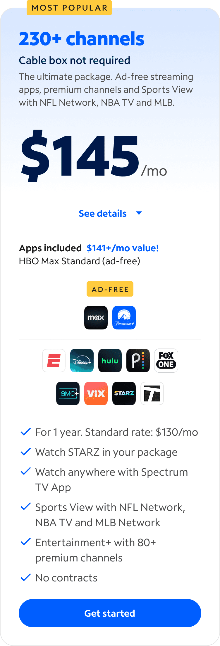
Competitor bundle cards
The goal was to dive into understanding how our competitors were positioning their cards. Paying attention to how they surface information on the bundles, what capabilities their pages offer for the cards, and the overall experience.

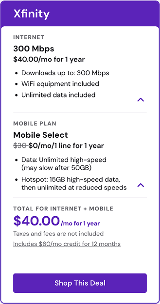

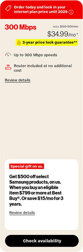

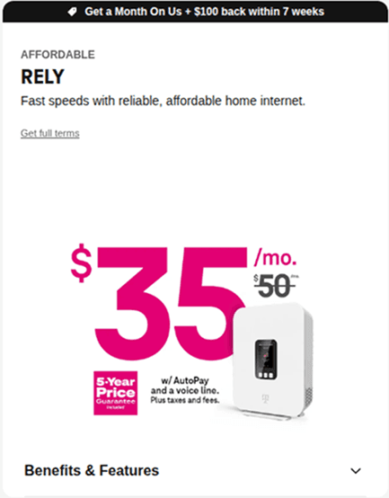


early design concepts
Early designs for immediate change
After understanding the competitor landscape, and early research on 'Plan Cards' specifically, it helped me to first draw early concepts to bring to discussion.
Phase 1
I presented my early design concepts during Pod meetings, and also presented it during Product shareouts that are done on a quarterly basis, where senior leadership were able to provide feedback.


+ Dropdown buttons decreased cognitive load
+ Possible header changes can add differentiation amongst other cards.
− The use of pill shaped tags were a little misleading due to it being seen as buttons.
− Having icons placed near drop-downs weren't a part of our patterns. Requiring developer and design system approval.
− Pricing was still unclear due to the price breakdown not being shown.
Phase 2
PM feedback reframed Phase 2 around decision clarity in the collapsed-card experience: disclose promotional terms upfront, surface trust signals before expansion, make tiers distinguishable at a glance, and create a flexible hierarchy where savings and promotional tags can coexist without competing for attention.

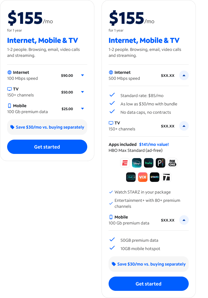

+ Persistent trust signals in the collapsed state can strengthen confidence before customers expand a card.
+ Clear visual differentiation across three side-by-side tiers can support faster package comparison.
− Promotional pricing does not state its duration, leaving customers unsure whether the displayed rate is permanent.
− Savings and burst tags have not been shown together, so their visual hierarchy and ability to coexist remain unresolved.
− Single-card concepts do not test whether customers can distinguish all three package tiers at a glance.
Usability Test
Signal Check (usability test)
Partnering with 3 UX researchers, we ran signal checks with Spectrum customers to find insights around our latest designs.
SIGNAL TEST / RESEARCH OUTCOME
Option 1 won 4 of 6 sessions.
The per-service price breakdown was the deciding factor. All six participants valued seeing how the total breaks down across services—even the two who preferred Option 2’s cleaner appearance wanted prices added to it.
KEY FINDINGS
01
“Streaming services included” was clearer than “Apps included” for 5 of 6 participants.
02
“1–2 people” read as a hard limit—not a bandwidth recommendation—and confused 4 of 6 participants.
03
“Add to cart” was preferred over “Get started” for familiarity by 4 of 6 participants.
04
The filterable packages-page direction was validated, but TV tier names still need descriptions and a broader evaluation against the existing experience.

OPTION 1 / PREFERRED
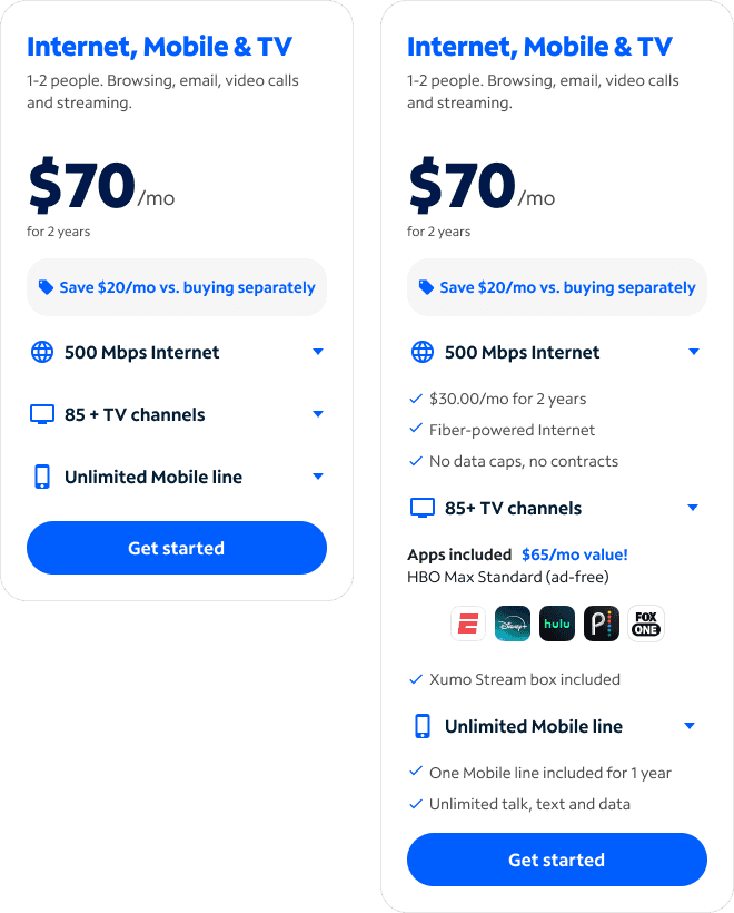
OPTION 2 / CLEANER
ONGOING PROJECT
To be continued. Package Pages will be next.
David Park
Senior UX Designer @Spectrum
Pages
Work
About
Contact
Connect
Read.cv
© 2025 David Park. All rights reserved.
Made in Framer