Re-imagining the retention dashboard so managers and VPs can see what's driving turnover.
I redesigned Paycom's retention dashboard so HR reps and managers could trust the numbers, see team health at a glance, and drill into the detail when they needed to.
View the shipped product
↗
DURATION
4 months
ROLE
Product Designer II
TEAM
1 PM, 1 Champion, 3 DS & Eng
TOOLS
Figma, HighCharts
Tested · comparative usability study, pre-launch · n = 12
67%
could trace a turnover number to the employees behind it, up from 33%
75%
built a department-and-location view without leaving the dashboard, up from 42%
70
SUS score, up from 51 on the current dashboard
Overview
A retention dashboard built around the questions HR kept asking.
The Retention Dashboard turns Paycom's scattered turnover reporting into one view HR teams and managers can trust, shaped by focus-group feedback from 11 client companies.

Tl;dr
Problem
HR couldn't trust the numbers. Managers couldn't even see them.
HR reps couldn't explain the turnover rate the dashboard showed them: widgets disagreed, and seasonal hiring could push the rate negative. Managers had no access, so they waited on HR for every answer.
Solution
A re-imagined dashboard managers could finally use.
A redesigned dashboard that HR reps and managers can trust, filter to their own part of the organization, and drill into all the way down to a single employee.
Process
Secondary Research
The same three problems, from the whole org down to a single employee.
The research covered both screens: the dashboard managers land on and the employee page they click into. I grouped focus-group feedback from 18 HR reps across 11 client companies, plus internal stakeholder notes, until three clear problems emerged.
35
Observations
2
Pages
7
Initial clusters
3
Core themes
Theme 01 — Trust · Both views
“I do the math myself and never land on the number the widget shows me.”
“The predictor hands me a score, but I have no idea what goes into it — or whether it’s ever been right before.”
“Every summer we hire a ton of seasonal staff and suddenly our turnover is negative. That can’t be right.”
Theme 02 — Breakdown · Org view
“I need it by department — and voluntary separate from involuntary. Those are totally different conversations.”
“We do a lot of contract-to-hire. If I can’t pull out the 1099s and part-timers, the number’s meaningless.”
“My managers and location leaders should only see their own people. Right now they wait on HR to bring it to the staff meeting.”
Theme 03 — Prediction · Employee view
“Honestly, I just want to know who’s at risk before they hand in their notice.”
“Most of our turnover is people leaving in the first 90 days. By the time I see it, they’re already gone.”
“By the time someone leaves, I can’t see what led up to it — the pay change, the new supervisor, the review that went sideways.”
Affinity Mapping
Clients told us exactly where the dashboards broke down.
Each cluster came down to one finding, and together they pointed to a single root problem: HR and managers had plenty of turnover data, but none they could trust, break down, or act on in time. That became the brief.
01 — Trust
When the math can’t be explained, none of the numbers get used.
HR reps couldn't reproduce the widget's percentages, the widgets contradicted each other, and seasonal hiring produced negative rates.
02 — Breakdown
One company-wide number hides where turnover is actually happening.
HR reps needed to break turnover down by department, location, and employee type, with voluntary and involuntary separated, without stitching reports together.
03 — Prediction
HR was reporting on turnover after the fact instead of preventing it.
Managers wanted to spot at-risk employees early, especially in the first 90 days, and connect those flags to survey and review data.
Primary Research
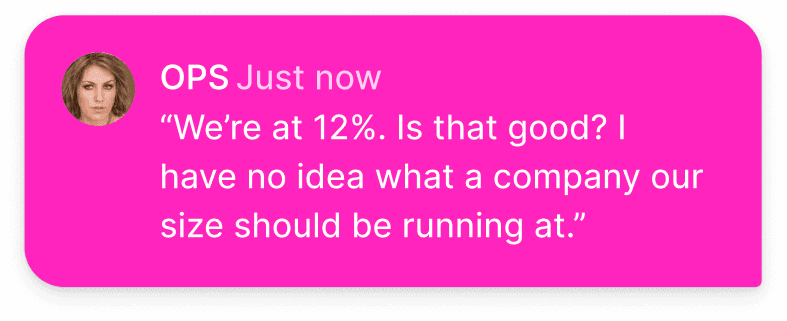
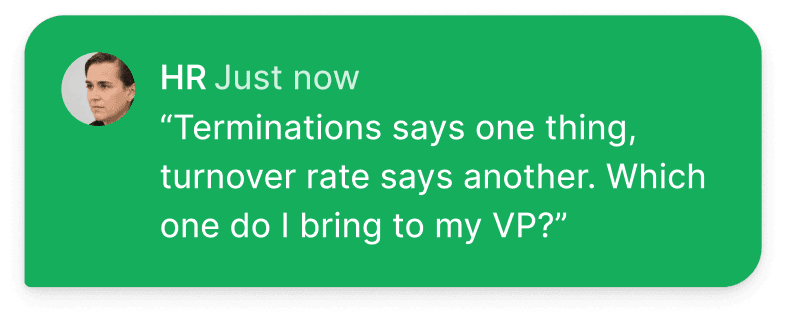
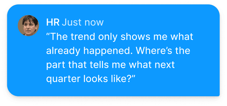
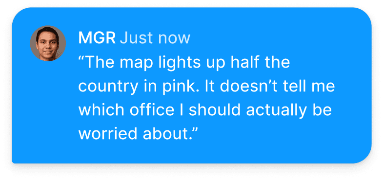
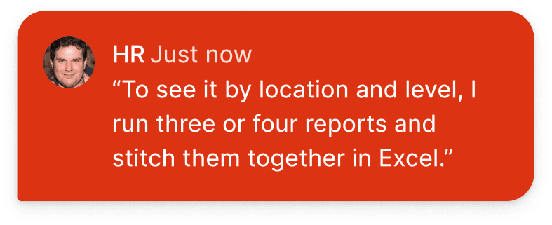
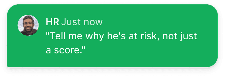
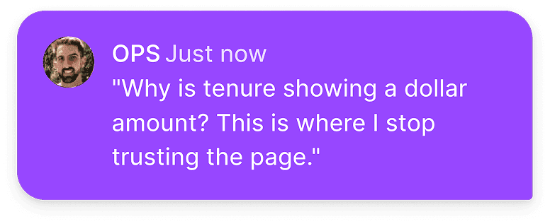
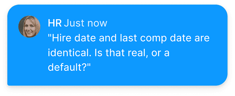
Paycom HR Reps were hitting the same three walls.
To check the findings, I interviewed HR reps on Paycom's own internal team, who use the dashboard to manage our workforce. The same three problems came up.




Competitive Analysis
What competitor platforms got right — and where they fell short.
Competitors covered the basics: segmented turnover, employee sentiment, and manager visibility. None offered what makes a number actionable: predictive analytics, customization, depth, or benchmarking.



How might we
How might we help every manager trust their team's turnover data enough to act early and retain their employees?
Design Principles
Three rules every design decision had to pass.
I owned the new widget visualizations and customization features, working from every research finding we had. With three data scientists, a PM, and a product champion, we focused on what HR reps and managers needed most.
01 — Show the math
Every number should be traceable to the employees behind it.
In the design: drilling into any widget opens a side-by-side view of the employees behind the number.
02 — Let the org shape the view
Filters should mirror how teams are actually structured.
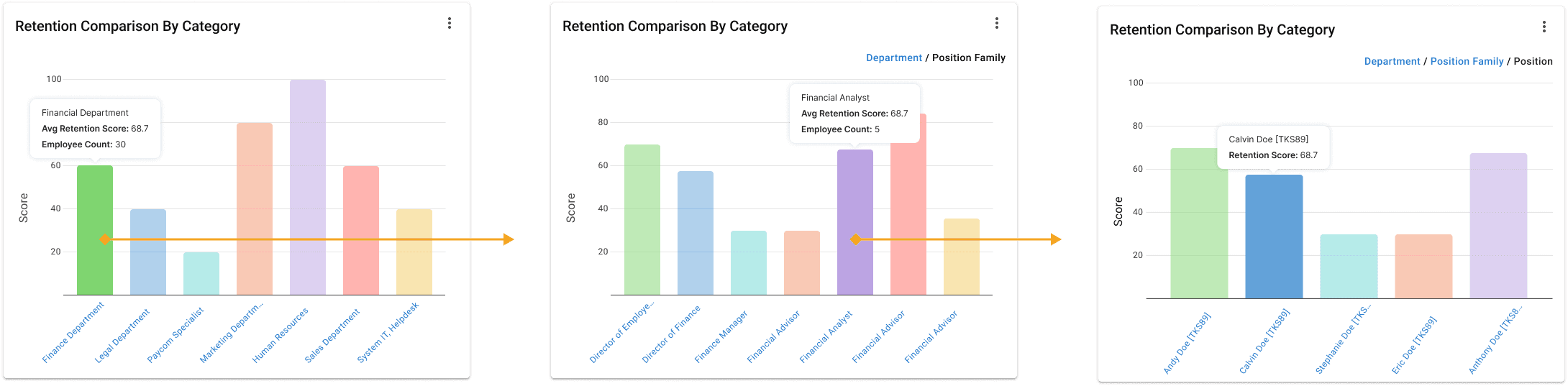
In the design: widgets filter by department, role, and sub-segment, and the employee table adapts to each role’s permissions.
03 — Lead with risk, not history
Surface who needs attention now, not who already left.
In the design: retention scores benchmarked against peers and teams, and an employee page built around intervention.
Ideation
I explored a wide range of data visualization components in HighCharts.
Many of the visualizations I explored looked good but didn't solve the problems HR reps and managers described. I kept returning to the research to narrow the options and checked feasibility with developers.
Winning Iteration
01
Easy to quantify
02
Tailored to each department or industry
03
Fitting business needs
Winning Iteration
01
Reduced visual clutter and prioritization on business decisions
02
Quicker recognition of performance gaps and crossovers
03
Legible axis labels to provide interaction and added description
Final Experience
The new retention landing dashboard
Managers wanted control over what they saw, not just more charts. I designed three layers of customization: chart type, category, and date range.
Graphical Widgets
Added drill-ability and graphic settings
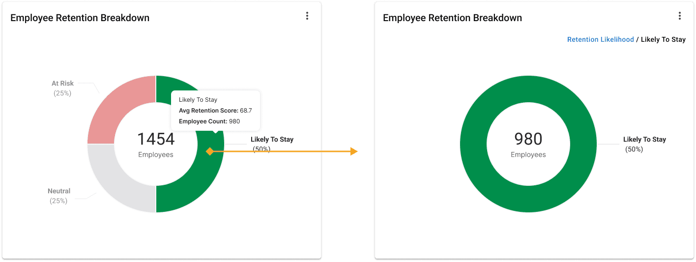
Every widget links to the employee table below it. Drilling into a chart opens a side-by-side view of the chart and the employees behind the numbers, so managers can check a figure without leaving the page.
Workforce Table
A table that adapts to permissions and roles
The employee table bridges the charts and individual employees. A configuration drawer lets managers choose which fields appear based on their permissions, so the same table works for an HR admin and a team lead.
Final Experience / Employee Detail Page
Employee details page
A drill-down page for one employee, giving managers a clear view of individual retention risk using Paycom's existing patterns and components.
Details Card
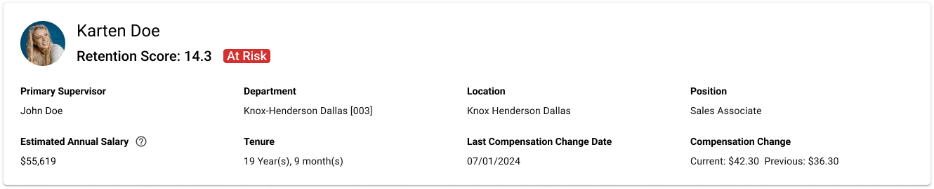
A snapshot at the top of the page.
The first card is a quick summary of who the employee is, their role, and current status, so managers keep that context as they scroll into the retention data.
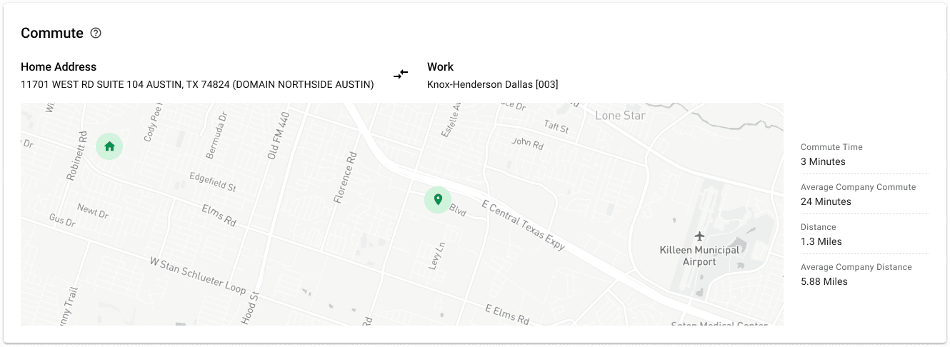
Commute Widget
A zoomable map for a non-obvious retention factor.
Commute time turned out to be one of the strongest predictors of whether an employee stays. A zoomable map shows an employee's commute next to the company average, so managers can see the risk and act on it.
Retention Scores by Team Widget
Benchmarking individuals against peers, teams, and departments.
Managers can compare an employee's retention score against peers, teams, or departments over time. Seeing the individual next to the group surfaces risk early, so managers can act before someone leaves.
Org Chart
Connecting individual risk to organizational structure.
The org chart shows where an employee sits and lets managers move across peers, teams, and reporting lines. Paired with retention data, it turns a static profile into a tool for understanding why someone might leave.
Iteration 05 / Handoff
Hand-off
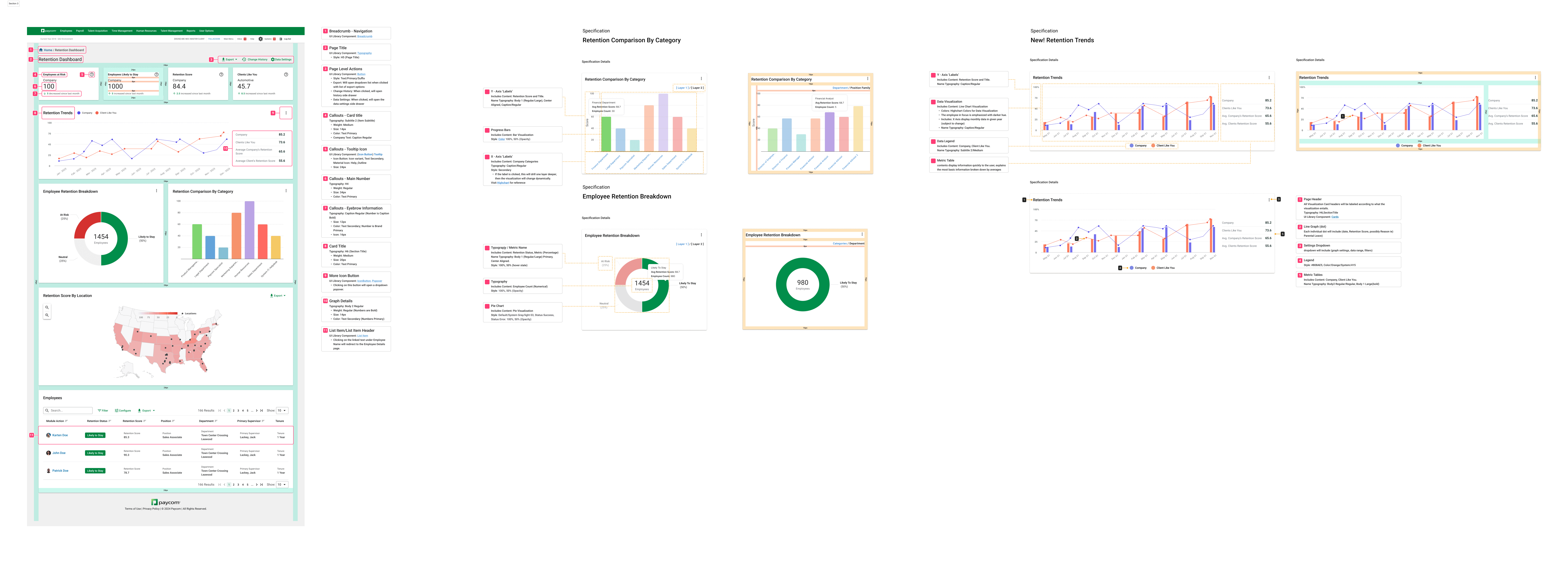
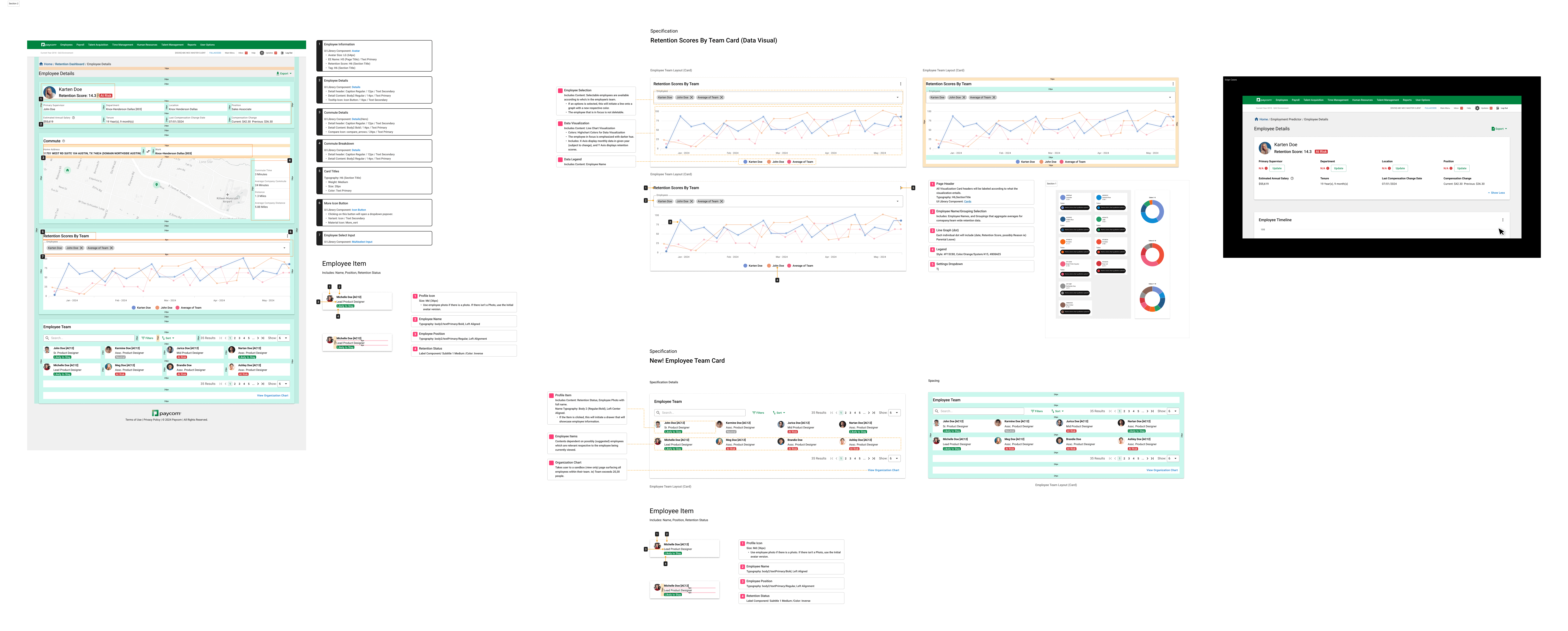
For handoff I produced spec sheets covering interactions, measurements, and edge cases, each referencing Paycom's design library and HighCharts standards, so what shipped felt like part of the product.
Outcome
A retention dashboard HR reps and managers can trust, with clearer visualizations, deeper customization, and a connected employee page for acting on risk early instead of reporting on it after the fact.
What comes next
Next Steps
Re-test the two fixes from the usability study, then validate the live experience with client HR teams.
Measurement
Track manager adoption, drill-in usage, and turnover-calculation support tickets to see what's working.
Scale
Bring the forecast view online once data science clears the model, and align the widgets with Paycom's broader analytics suite.
Ending Notes
What I'd carry forward.
The usability test gave us clear wins and open questions, and both shaped how I approach data products now. Three things I'd carry forward:
→
Giving users a way to see the data behind a number wasn't enough. Several still took it at face value, so transparency only builds trust when the interface invites users to check.
→
Users still raised concerns about the predictive side of the dashboard. Technical feasibility on the data science side was the blocker, so we set that expectation clearly instead of leaving the gap unexplained.
→
The design system had no answer for three needs: knowing whose data you're looking at, understanding how a score is calculated, and showing sensitive details only to the right roles. Those became new shared components.
There is more here than fits on one page — the iterations that did not survive, and the data constraints that shaped the final scope. :)
←
Return back home
©2026 David Park
| Made with love in NYC
Thanks for being here.