Case Study / 2024
Paycom Retention Dashboard
Duration
4 Months
Role
Product Designer
Team
1 PM, 1 Champion, 3 DS & Eng
Tools
Figma, HighCharts
Overview
Re-imagining the retention dashboard so managers and VPs can finally trust their data and act on it.
The Challenge
Managers couldn't trust the data they were seeing.
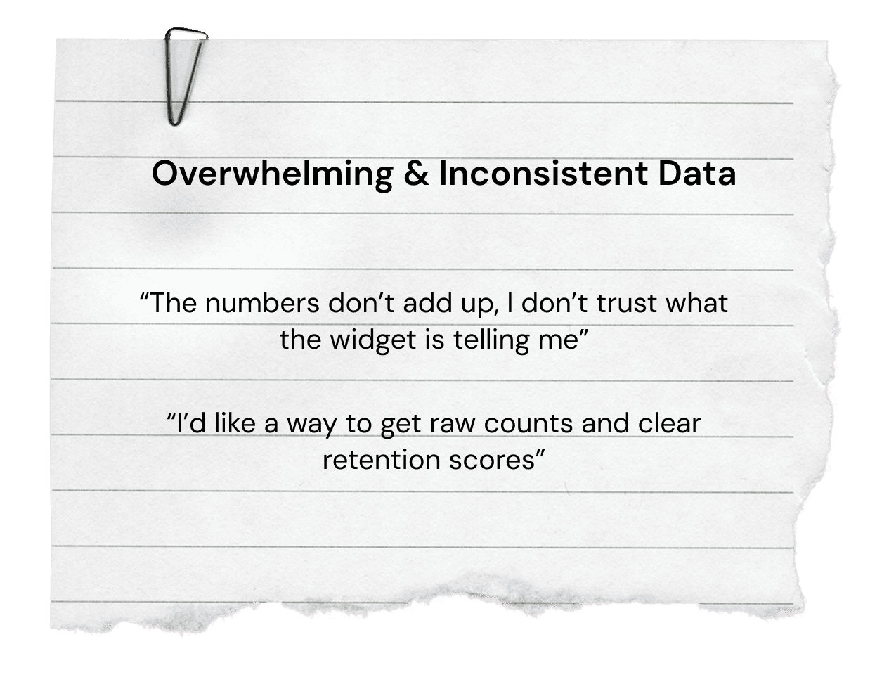
Paycom's existing retention dashboard was constrained by weak functionality and unreliable data — leaving managers and VPs unable to surface meaningful insights about their teams. How might we give leaders visibility into employee performance and engagement they can actually act on?
The Solution
A re-imagined dashboard managers could finally use.
A redesigned retention experience that helps managers visualize the health of their teams and business performance — built on trustworthy data, with the customization and depth they actually need.
Research
Talking to HR reps surfaced three patterns we had to fix.
We ran usability sessions with our internal HR team to understand what was working — and what wasn't — in the current dashboard. Three insights drove the redesign.
Three Key Insights
01
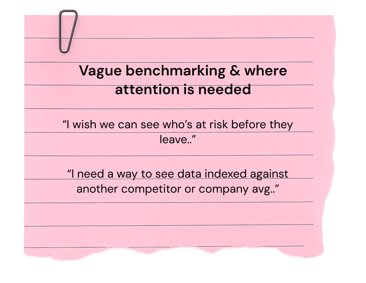
Managers wanted predictive signals, not just reports of what already happened.
02
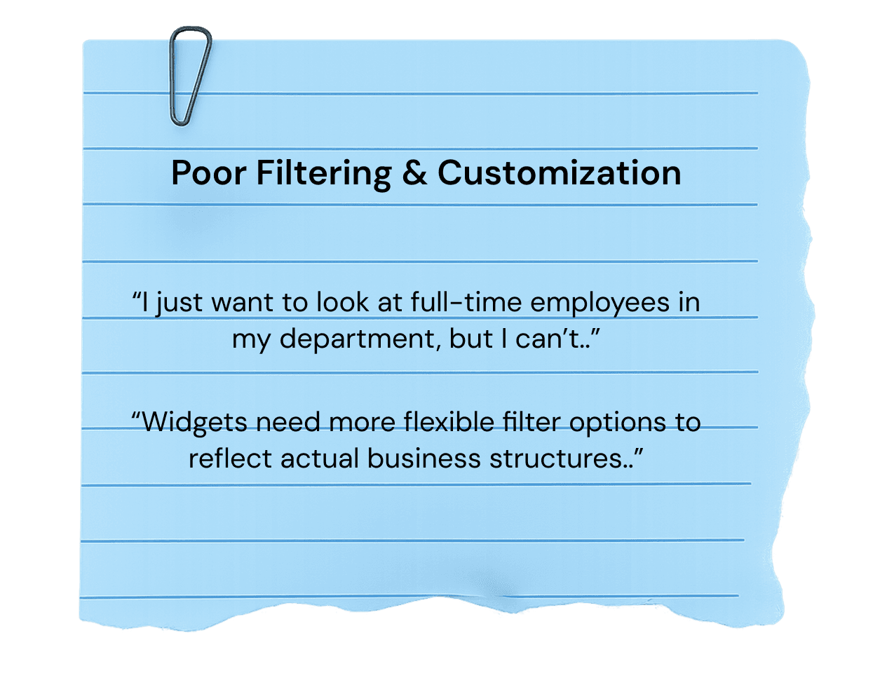
Customization was nearly non-existent — every team saw the same generic view.
03
Without benchmarks, managers had no way to know if their numbers were good or bad.
Competitive Analysis
What competitor platforms got right — and where they fell short.



Strengths
+ Basic churn segmentation
+ Employee sentiment tie-in
+ Manager visibility
Weaknesses
− No predictive analytics
− Limited data customization
− Shallow analytics depth
− Lack of benchmarking
Process
Driving improvements in visualization and feature delivery.
I owned the design of future-state widget visualizations, customization features, and addressed every UXR point we collected. Partnering with three data scientists, one PM, and a product champion, we focused on the priorities that came first.
What I owned
01
Widget visualization & customization
Three levels of control — chart type, category, and date range — letting managers tailor retention insights to their needs.
02
Drill-in & comparison capabilities
Linking widgets to the employee table below, with a modal for side-by-side comparisons against responsible employees.
03
Employee details page
A drill-down page with retention scores by team, commute mapping, and an org chart connecting individual risk to the broader organization.
Outcome
A retention dashboard managers actually trust.
The redesigned experience shipped to managers across the company. With clearer visualizations, deeper customization, and a connected employee details page, leaders now have a tool that supports proactive retention decisions instead of after-the-fact reporting.
Next Steps
Conduct further usability testing on the live experience to validate the major changes.
Measurement
Track KPIs to identify areas needing further investment and increase manager engagement.
Scale
Align future iterations with Paycom's broader analytics ecosystem so widgets work across products.
Design Decisions
Five iterations that shaped the redesign.
Each decision came from a specific user pain point. Here's what changed, why it changed, and what the trade-off was.
Exploration
Top level cards
During a cross-functional sync, we identified a critical reframe: stakeholders didn't just need churn visibility — they needed retention intelligence they could act on. I've restructured the information hierarchy, partnering with engineering to implement HighCharts for richer data visualization, and reducing the cognitive load required to surface actionable insights
Winning Iteration
01
Easy to quantify
02
Tailored to each department or industry
03
Fitting business needs
Exploration
From a static line graph to interactive, comparative charts.
The original retention graph displayed a single static line — limited context, with users relying on a top-right dropdown to adjust the time frequency. The interaction felt unintuitive, and the data didn't reflect real-time changes.
What I introduced with HighCharts
→ Multiple comparative data lines (e.g. company vs. industry benchmarks)
→ Interactive hover tooltips, data settings, and filtering
→ Alignment with My Analytics — Paycom's broader analytical suite
Winning Iteration
01
Reduced visual clutter and prioritization on business decisions
02
Quicker recognition of performance gaps and crossovers
03
Legible axis labels to provide interaction and added description
Iteration 02 / Customization
Three levels of widget control, instead of one generic view.
Research showed managers wanted control over what they saw — not just more visuals. I designed a customization model with three layers, each scoped to what HR teams actually needed to swap on the fly.
Layer 01
Chart type
Switch between line, bar, or comparative views.
Layer 02
Category
Filter by department, role, or sub-segment.
Layer 03
Date range
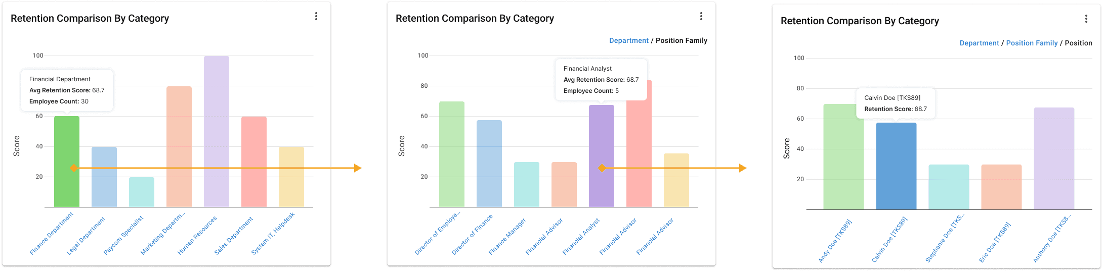
Compare any two periods — quarter, year, or custom.
Iteration 03 / Drill-in
Linking widgets to the data behind them.
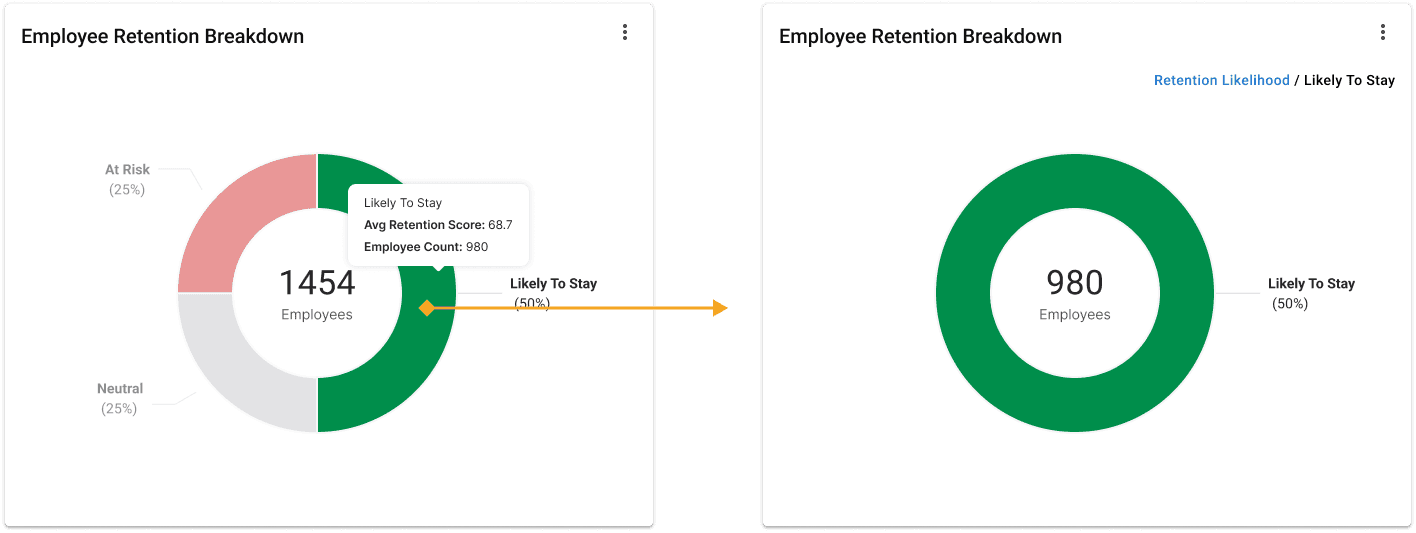
Visualizations and the employee table were disconnected — managers had to mentally bridge between numbers and people. I linked the widgets directly to the table: drilling into any chart opens a side-by-side modal showing the visualization next to the responsible employees, so cause and effect sit on the same screen.
Iteration 04 / Employee Table
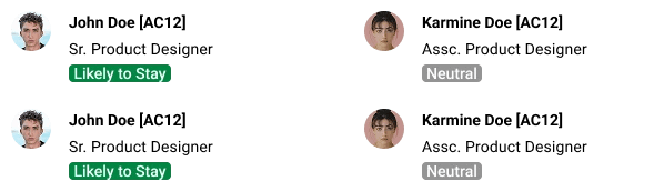
A table that adapts to permissions and roles.
The employee table is the bridge between dashboard visualizations and individual people. With a configuration drawer, managers can adjust which fields appear based on their permissions and reporting structure — keeping the same surface useful at every level of the org.
Iteration 05 / Handoff
Hand-off
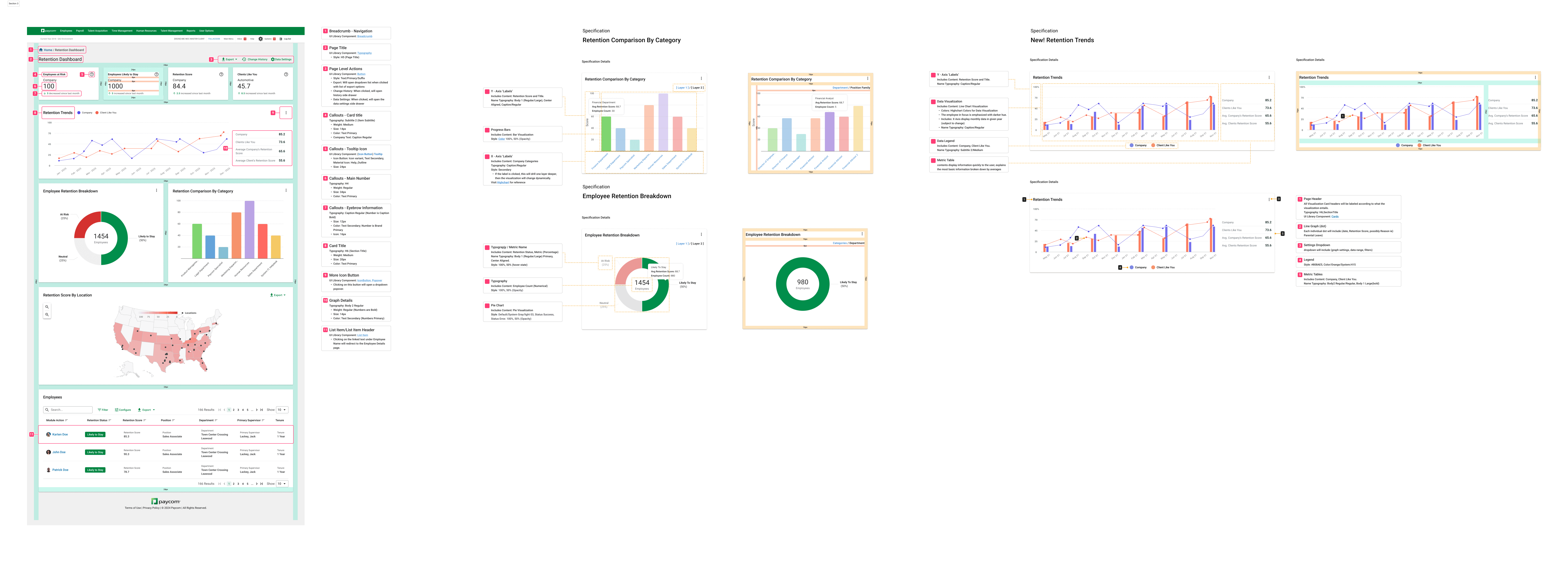
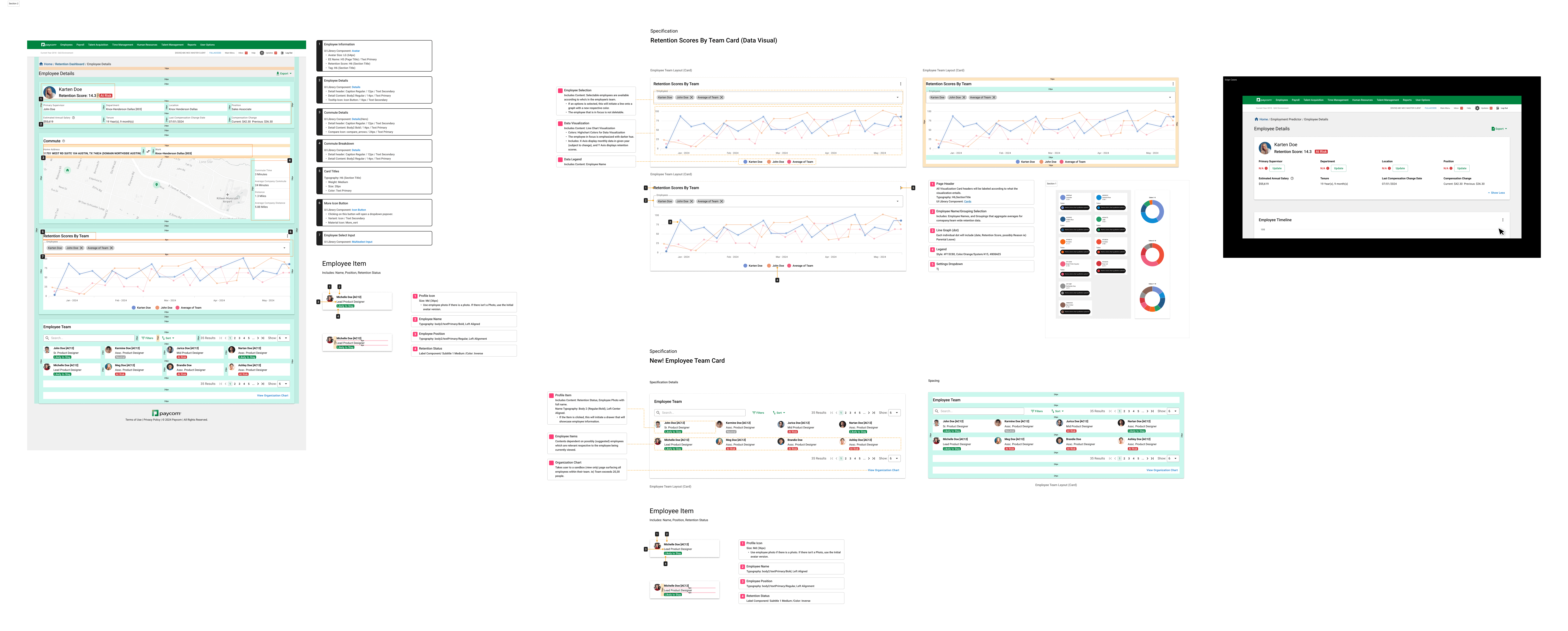
During engineering handoff I produced spec sheets covering interactions, measurements, and edge cases. Each spec referenced the existing Paycom design library and HighCharts visual standards, so what shipped felt cohesive with the broader product — not a one-off retention experience.
Part 02 / Detail Page
Designing the employee detail page.
An employee profile drill-down feature, giving managers visibility into individual retention risk while maintaining consistency with existing patterns and components.
Module 01 / Details Card
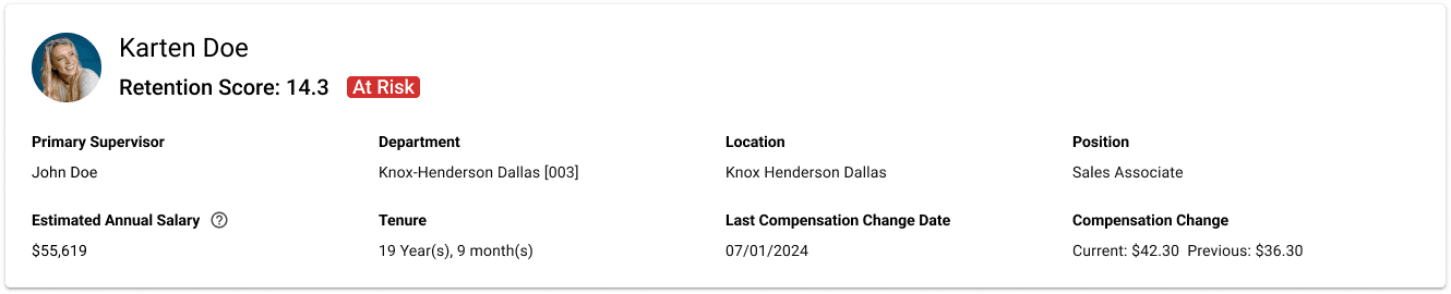
A snapshot at the top of the page.
The first card on the page is the employee details card — a glance-able summary of who the employee is, their role, and their current status. It anchors the rest of the page so managers always have context as they scroll into the deeper retention data below.
Module 02 / Commute
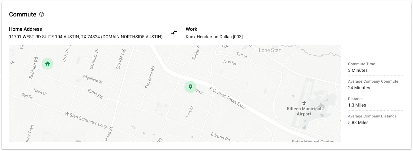
A zoomable map for a non-obvious retention factor.
Commute time turned out to be one of the most predictive variables in retention scoring. To make this legible, I designed a zoomable map that places an employee's commute alongside the company average — turning an abstract score into a spatial story managers can act on.
Module 03 / Retention by Team
Benchmarking individuals against peers, teams, and departments.
A retention score visualization that lets managers compare an employee against peers, teams, or departments over time. The comparative lens surfaces both individual risk signals and broader organizational trends, so managers can act proactively instead of reactively.
Module 04 / Org Chart
Connecting individual risk to organizational structure.
The org chart shows where an employee sits within the broader hierarchy and lets managers navigate across peers, teams, and reporting lines. Pairing it with the retention data turns the page from a static profile into an investigation tool.
Iteration 05 / Handoff
Hand-off
During engineering handoff I produced spec sheets covering interactions, measurements, and edge cases. Each spec referenced the existing Paycom design library and HighCharts visual standards, so what shipped felt cohesive with the broader product — not a one-off retention experience.
Reflections
What I'd carry forward.
With limited research time and a high-priority timeline, the work was as much about uncovering motivations and use cases quickly as it was about visual design. Three things stuck with me — and shaped how I approach data products now.
01
Customization is a feature, not a setting.
Every team's relationship with their data is different. Building three layers of widget control turned a generic dashboard into something each manager could make their own.
02
Numbers without people are easy to dismiss.
Linking widgets to the employee table — and to the detail page — was the move that made the dashboard feel actionable instead of aspirational.
03
A new product still has to feel like the system.
Aligning with Paycom's existing library and HighCharts standards meant the redesign felt cohesive — not like a one-off feature bolted onto a familiar product.
David Park
Senior UX Designer @Spectrum
Pages
Work
About
Contact
Connect
Read.cv
© 2025 David Park. All rights reserved.
Made in Framer