

Paycom Analytics Retention Dashboard / Employee Details Page
Duration
4 Months
Role
Product Designer
Team
1 Product Champion
1 Product Manager
3 Data Science & Engineer
Tools
Figma
HighCharts
Context ———————
The Challenge
Managers and VPs struggled to uncover meaningful insights about their teams due to a limited dashboard experience — constrained by weak functionality and unreliable data. How might we empower leaders with visibility into employee performance and engagement they can trust?
The Solution
A re-envisioned way to effectively oversee retention dashboard that enables managers to fully visualize the health of their employees and business performance.
Competitive Analysis ———————
COMPETITOR PLATFORMS


Strengths
Basic Churn Segmentation
Employee sentiment tie-in
Manager visibility
Weaknesses
No Predictive Analytics
Limited data customization
Shallow analytics depth
Lack of benchmarking
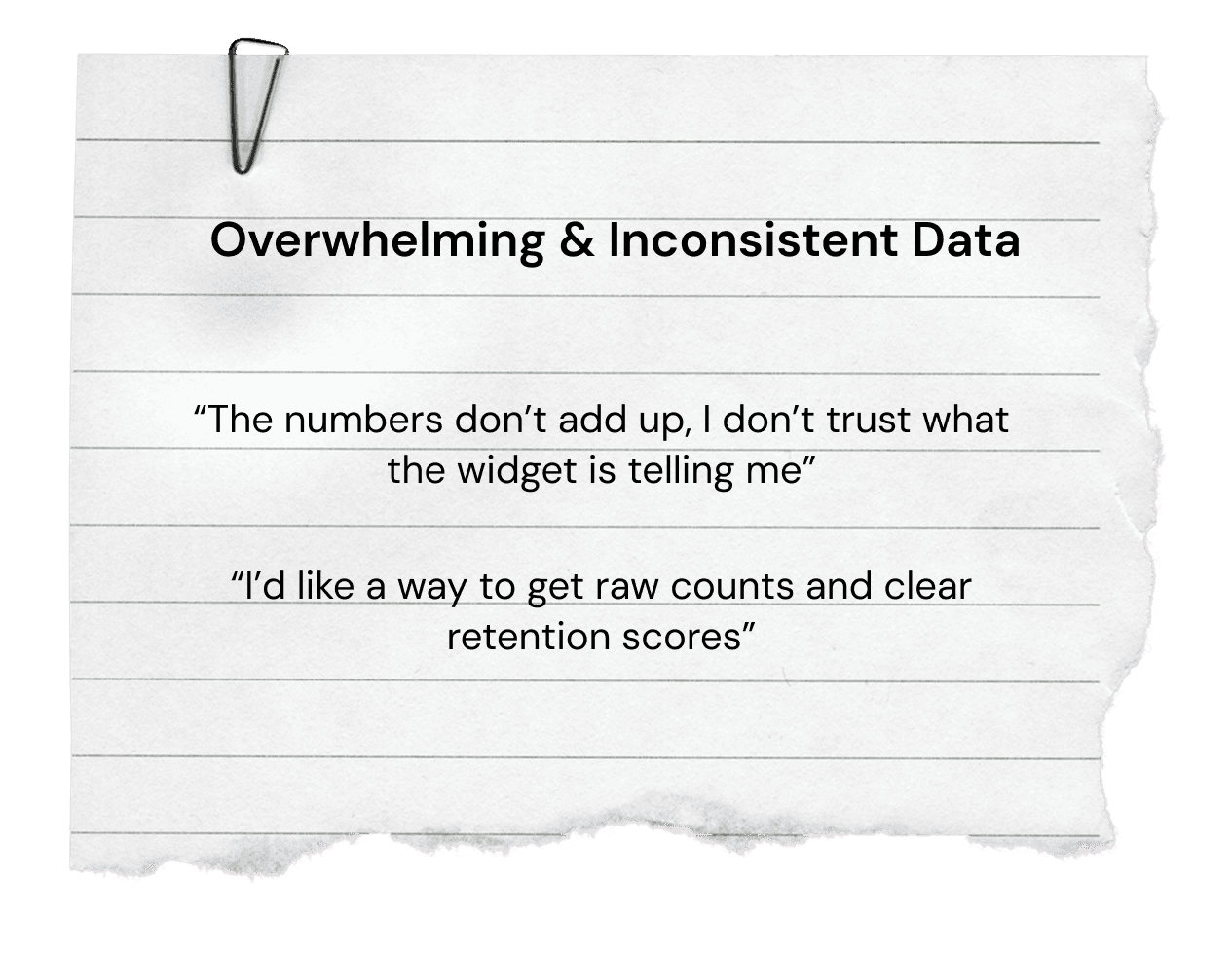
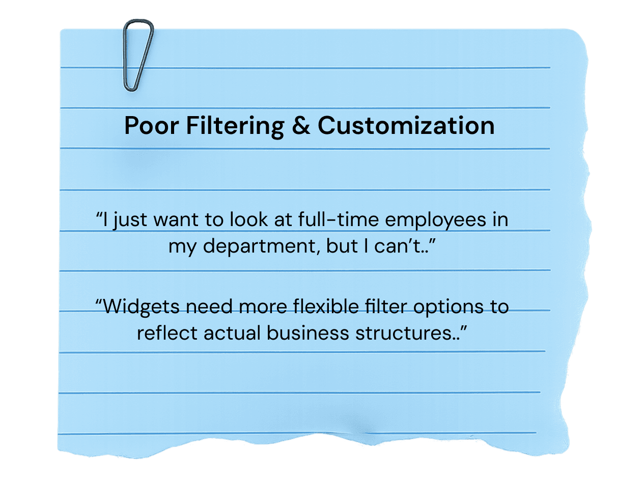
Usability Test - Current ———————
Interviewing HR Reps to uncover the frustrations of the current state dashboard
To uncover how we can best understand the use-cases for both visual and functional requirements, we workshopped an usability test with our internal HR team. Within this group we discovered core insights that helped drive where our focus can be for the next re-design.
3 Key insights

Team Coordination and Project Ownership ———————
I drove improvements in visualization and feature delivery, ensuring managers had access to the insights they needed to make informed decisions.
To achieve our team's goal of creating a redesigned dashboard, we focused on the priorities that came first. I took ownership and led the design of future state widget data visualizations, customization features, and made sure to address the UXR points collected. I partnered with 3 data scientists, 1 product manager, and 1 product champion.
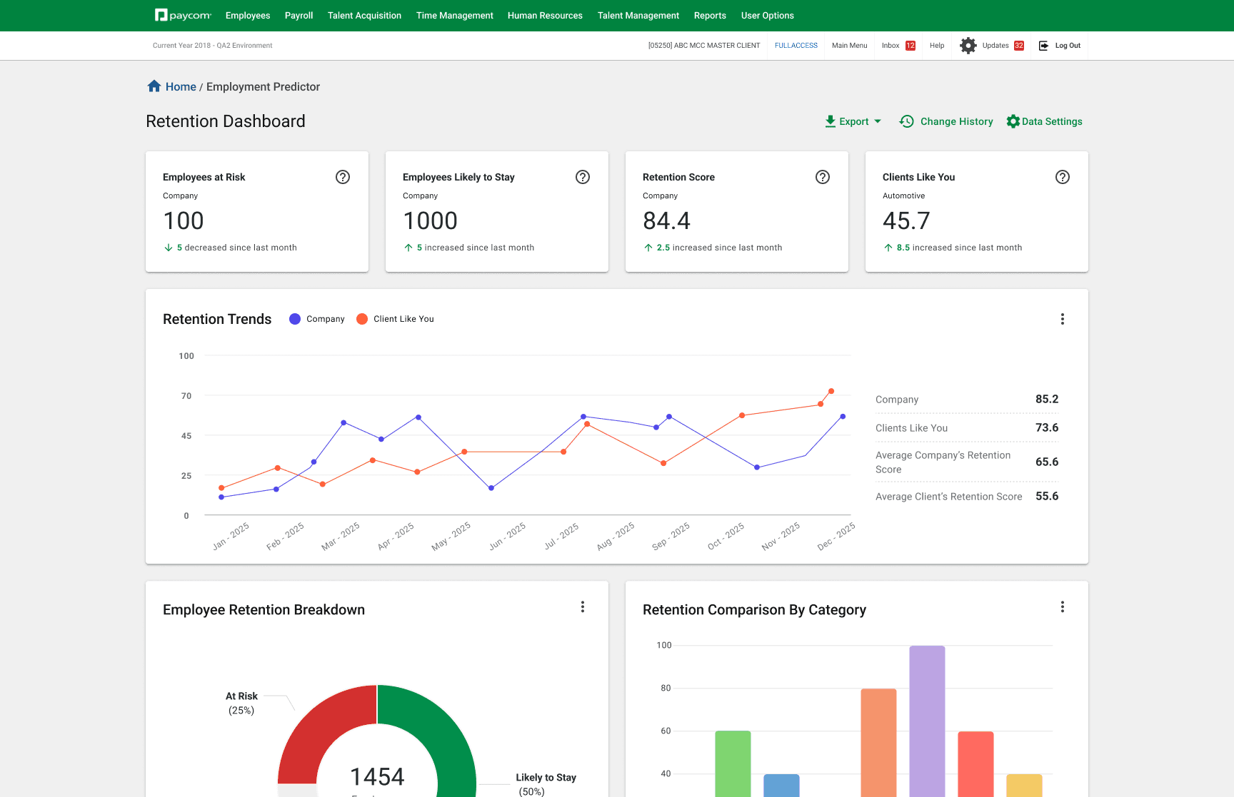
Current State Dashboard ———————
Current state functionality and visual requirements to benefit users.
To better understand the current state functionality, visual hierarchy, future goals of this project, I audited multiple screens to uncover what changes would make the most sense for our users.
Previous Dashboard

Iteration ———————
First up— Improving visualization of widgets to address configurability and interaction
In a weekly sync with our PMs and Engineers, we aligned on a key shift in user goals: moving from simply displaying churn data to surfacing deeper, retention-focused insights. In response, I began iterating on clearer ways to present this information — defining a more intuitive hierarchy, leveraging, HighCharts for improved visual clarity, and streamlining access to insights to help users interpret the data faster.
Winning Iteration
01
Easy to quantify
02
Tailored to each department or industry
03
Fitting business needs
Iteration ———————
Next— Adding more insight into the retention trends
Iteration ———————
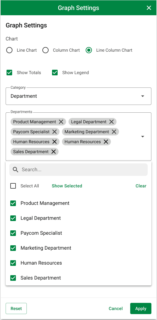
Widget graphical settings
User research revealed that while managers valued additional visuals, they wanted greater control over how the information was displayed. To address this, I designed three levels of customization—chart type, category/sub-category, and date range—allowing managers to tailor retention insights to their specific needs.
Graphic Settings
Iteration ———————
Drill-in and closeup comparison Capabilities
It was also important to link the widgets to the employee table below, since the table represents the data behind the visualizations. When a user drills down into a visualization, it opens a modal that displays the visualization alongside responsible employees for side by side comparison.
Drill-able visualizations

Close Up Modal Prototype
Iteration ———————
Employee Table
The employee table helps managers connect employee details with dashboard visualizations. With the configuration drawer, they can adjust dashboard views based on permissions.
Graphic Settings
Part 2 — Designing the employee's detail page
The employee details page serves as a way for managers to roll up more granular retention data for individual employees.
Kickoff ———————
Leading the new designs for employee details page
I enhanced the retention dashboard for clarity and scalability by introducing an employee profile drill-down feature, giving managers visibility into individual retention risk while maintaining consistency with existing patterns and components.
Iteration ———————
First up— Detail card
The first card seen in this page is the details card. This card serves as way to provide employee information quickly and at a glance.
Details Card

Iteration ———————
Employee commute
Because commute time significantly influenced retention scores, I designed a zoomable map to show commute distances in context—making it easy to compare an employee’s commute against company averages and identify potential risk factors.
Commute Card
Iteration ———————
Retention Scores by team graph
I designed a retention score visualization that allows managers to benchmark employees against peers, teams, or departments over time. This comparative approach surfaces both individual risks and organizational trends, enabling managers to take proactive measures to improve retention. By providing a clear, scalable view of performance patterns, the visualization helps ensure data-driven decisions around employee engagement and organizational strategy.
Retention Visualization by Team
Iteration ———————
Lastly— Employee organization
The employee organization chart gives managers visibility into where an employee sits within the hierarchy and makes it simple to navigate across peers and teams, ensuring a clearer understanding of organizational structure.
Organization Chart
Spec ———————
Setting the final specs and guidelines for handoff
During handoff, I created a spec sheet outlining interactions and element measurements to support developers. This aligned with our Paycom design library and Highcharts’ visual standards for consistency.
Spec sheet
Next Steps
Conduct User Testing
User testing will reveal how users interact with the product, validating the major changes which were implemented.
Measure KPIs & Analytics
Measuring KPIs is crucial for identifying areas of the product that need further development, and ones that increase engagement.
Synchronous to other products
Paycom offers multiple analytical products that share data. While the Retention Dashboard has unique visualizations, future iterations can be designed for scalability and a shared ecosystem of widgetized visuals across products.
With limited research and a high-priority timeline, I quickly uncovered user motivations, use cases, and key focus areas. These insights guided the design of visualizations and functionality that help managers better understand their employees' retention data.