Optimizing Cheer's Search and Discovery
Duration
14 Weeks
Role
Lead Product Designer
Team
1 PM
1 Owner
1 CTO
Tools
Figma
Context ———————
What is Cheers?
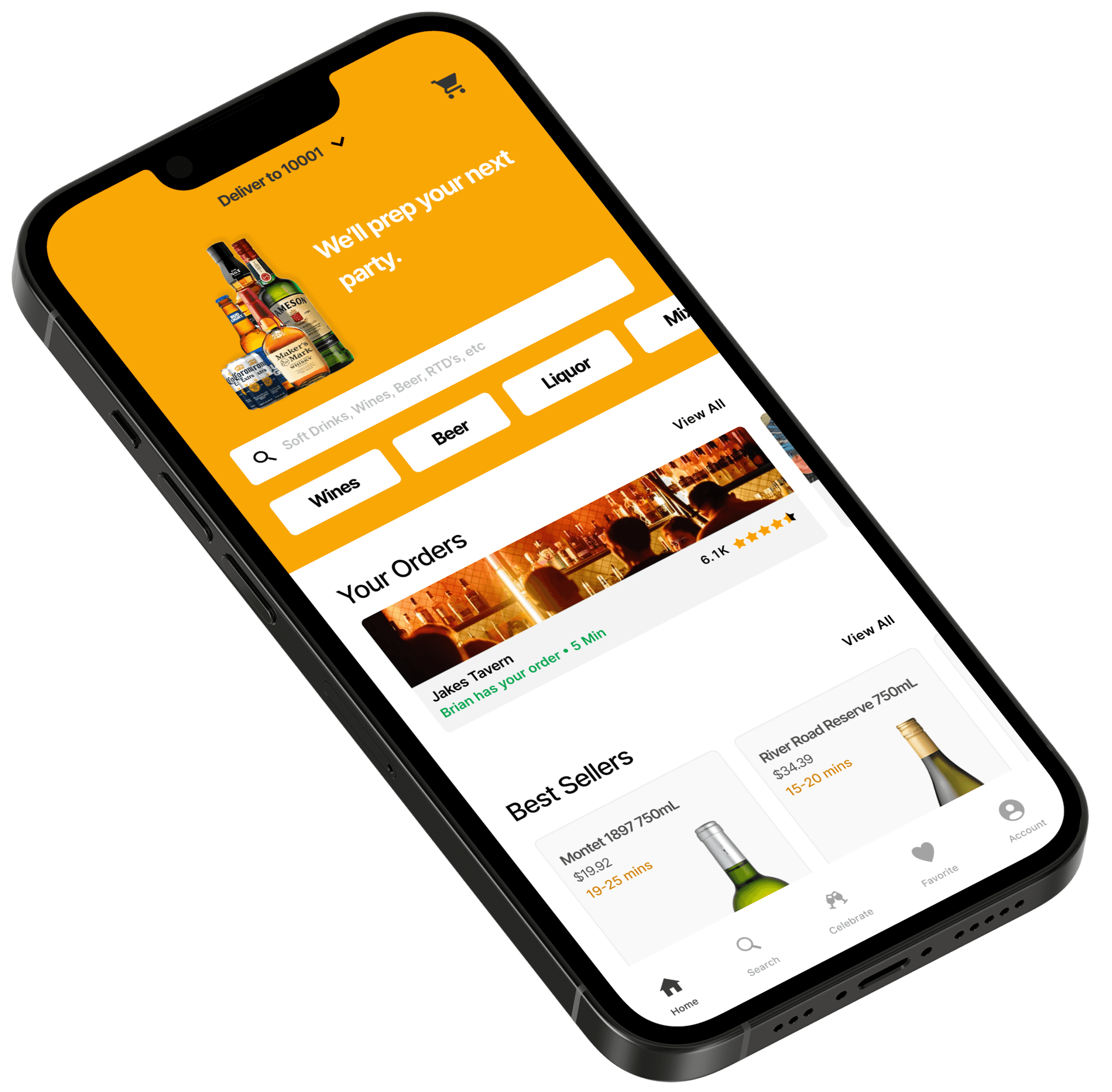
Cheers is a New York–based startup delivering alcoholic beverages from local liquor stores and bars directly to users on-demand. The platform simplifies ordering—eliminating unnecessary store visits, saving time, and providing curated access to NYC’s top drink options.
During the height of the pandemic, social distancing and limited mobility left at‑home shoppers feeling disconnected from their usual local discoveries. Our design objective addressed this by infusing personalization and social engagement into Cheers—bridging the gap for New Yorkers who missed the spontaneity and community of in-person browsing.
The Problem ———————
Discovering and enjoying local drinks from home is impersonal and disconnected.
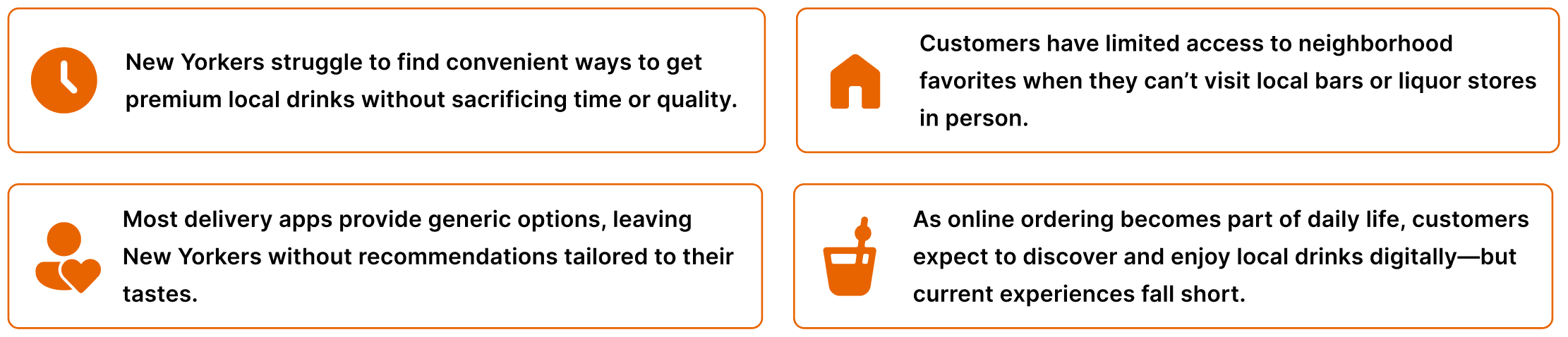
For many New Yorkers—especially during the pandemic—ordering drinks from home became the norm, yet delivery apps offered only generic options, with no access to locally made cocktails or neighborhood favorites, no personalization, and little connection to the community.
User Research ———————
How are customers shopping during the pandemic? What interests them?
We wanted to gain a better understanding of how customers felt about shopping for beverages during the pandemic across new york, we identified a few common grievances and key insights.
Interview / Desk Research
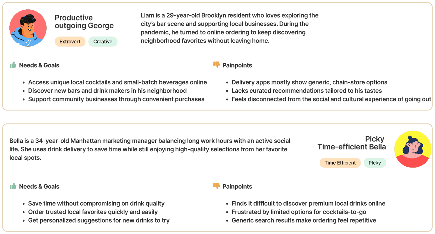
In analyzing user research, we developed two user personas that best embodied our target audience's needs, pain points, and goals.
User Persona
User Research ———————
Defining the opportunities based on core problems
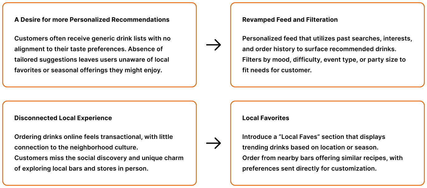
After gathering user interview data and key insights, we identified the core challenges customers face when seeking a more personalized and guided way to discover local favorites. This analysis revealed two primary pain points that require focused solutions:
Opportunity
Ideation ———————
Exploring Key features to address the missing personalized and locally produced drinks in NYC
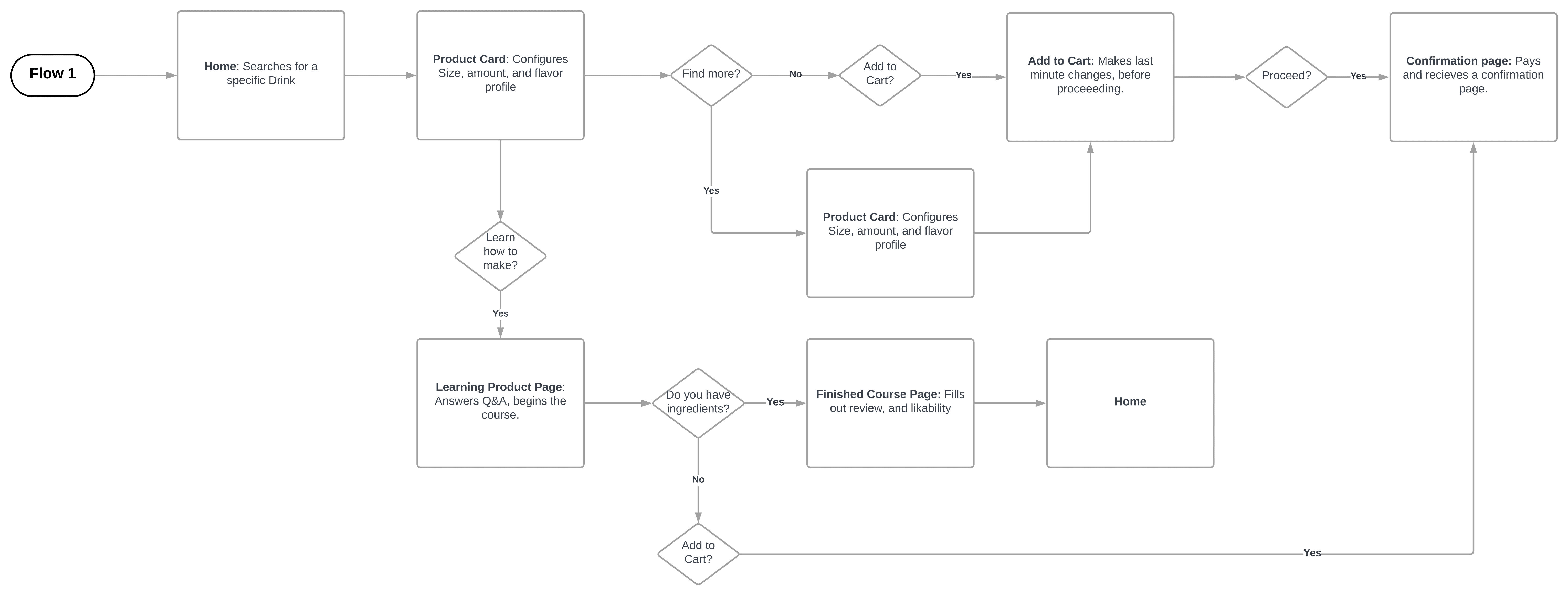
Upon taking our user research and noting key pain points to address, we brainstormed and mapped out the preliminary user flow through which our feature would fit within our product.
User Flow
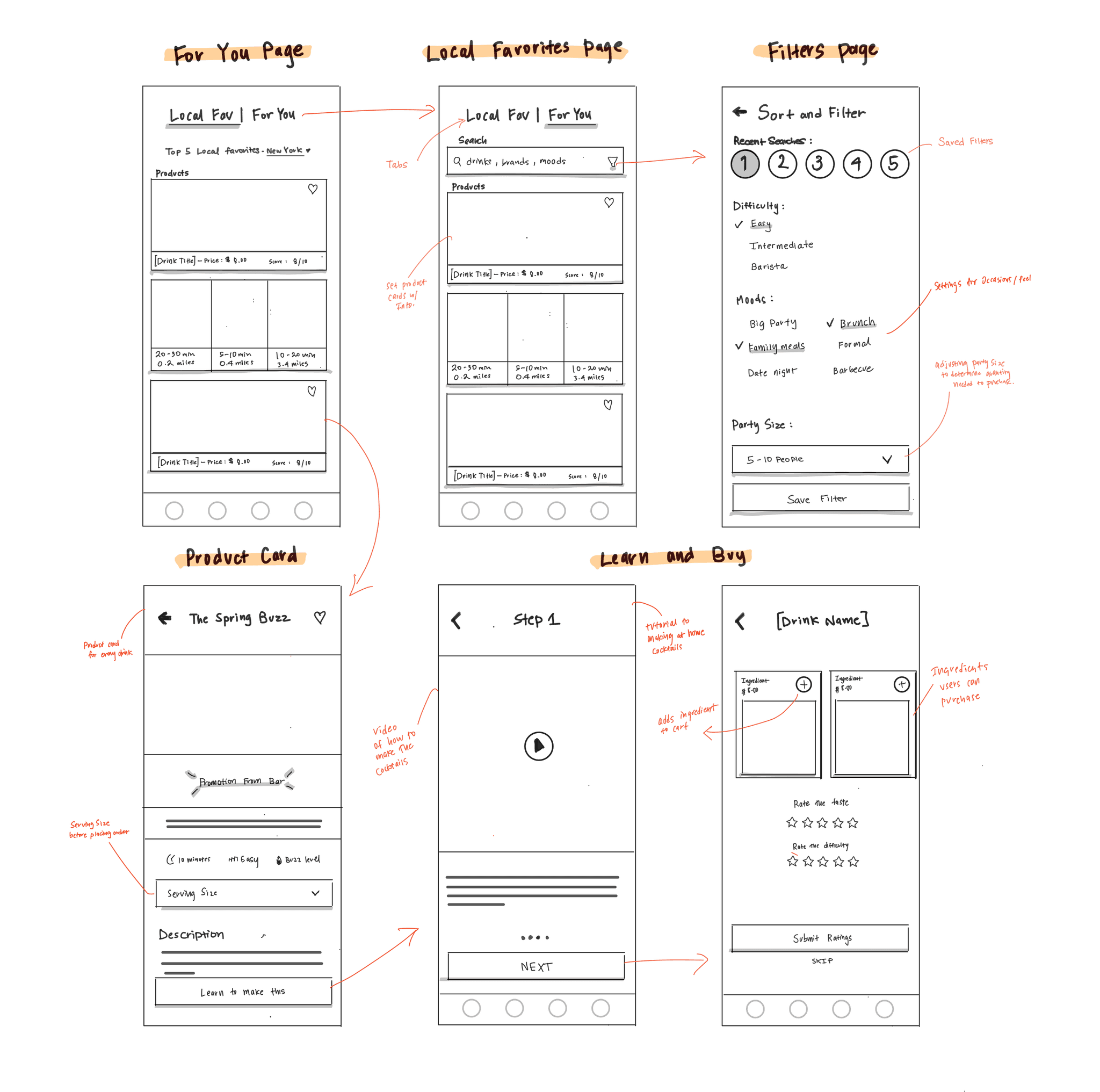
I created low-fidelity sketches to showcase potential ideas and envision the core screens of this feature. These included the Local Favorites and For You pages, along with screens that allow users to learn how to build cocktails at home by ordering the necessary ingredients.
User Flow
Iteration & User Testing ———————
User testing to validate new features
After completing preliminary low-fidelity sketches, I moved into mid-fidelity wireframes to prepare for usability testing. This stage allows me to evaluate how effectively the discovery features support user goals, uncover usability issues, and iterate on the design based on feedback.
'Local Faves' Page
When creating iterations of the “Local Faves” page, I explored various layouts to highlight the discovery of popular local items and bars. To avoid overwhelming users with too many item cards, I narrowed the scope of the “Local Faves” page to the following options.
Local Faves
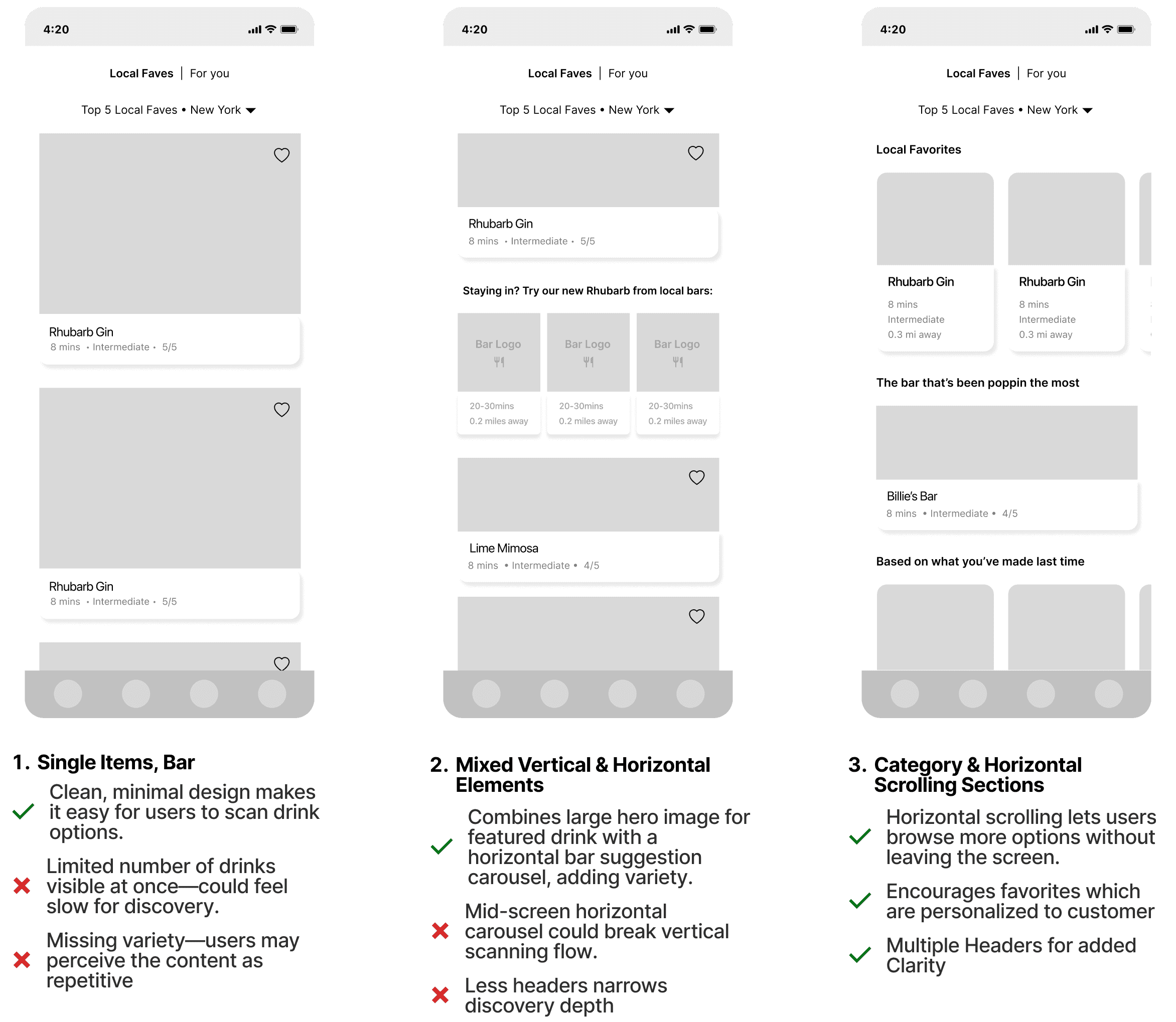
We selected Option 3, incorporating horizontal scrolling to introduce greater variety in product presentation. Usability testing indicated that the first two options appeared visually sparse, reducing the discoverability of nearby products and bars. Additionally, the inclusion of visual headers provided greater clarity as users began scrolling through the content.
Iteration & User Testing ———————
'For You' Page
While iterating on the “For You” page, we analyzed how personalization filters could improve the speed and discoverability of drinks based on customer interests. The following are some layout sketches to, which a customer will see to get started.
For You
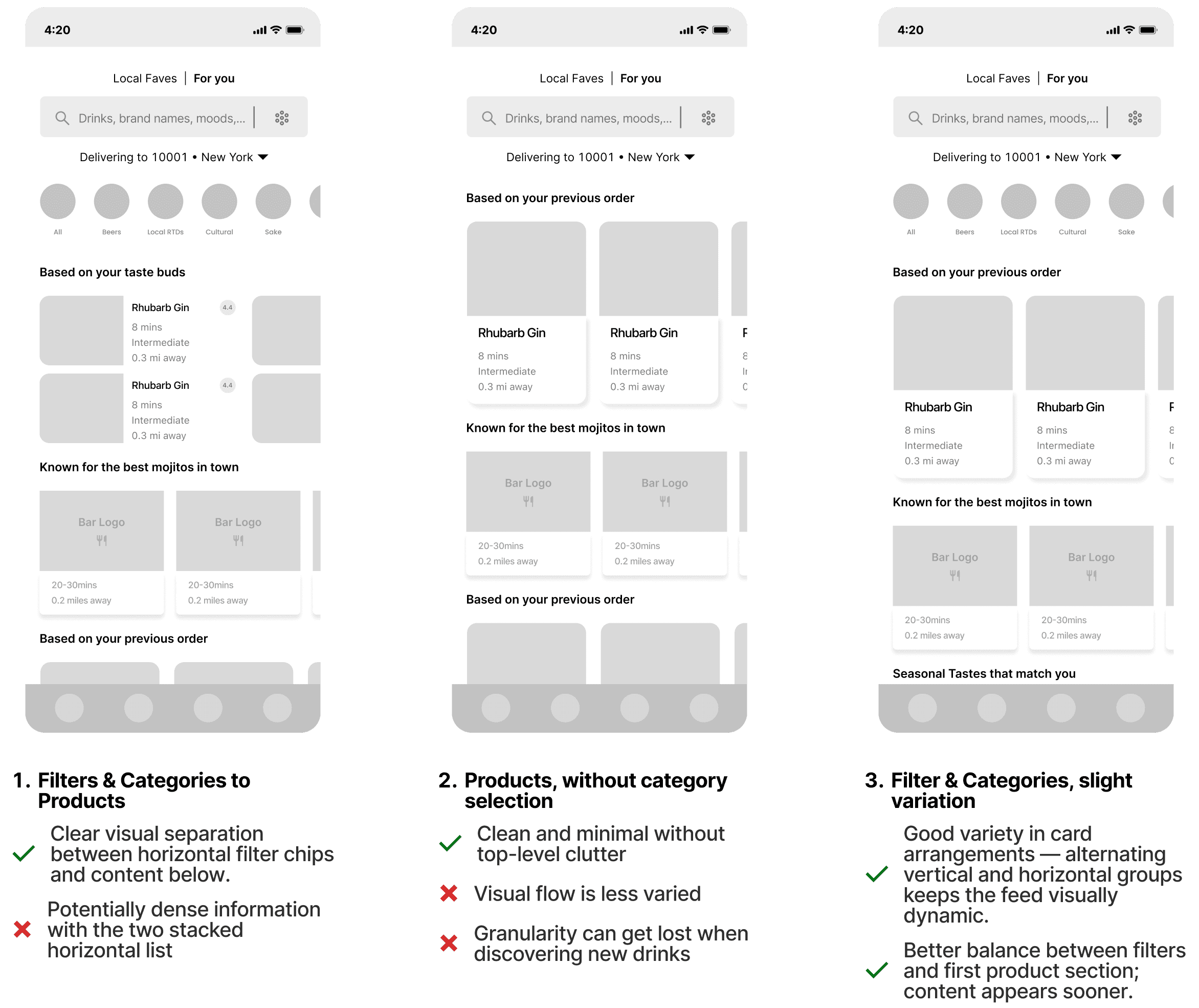
We selected Option 3, for its adaptable layout, strong emphasis on filter settings and category selection, and balanced visual hierarchy. Alternating vertical and horizontal card arrangements keep the feed engaging, while top filter chips provide quick control without overwhelming the screen. This design enables users to see personalized recommendations sooner, explore a variety of options, and navigate efficiently.
Iteration & User Testing ———————
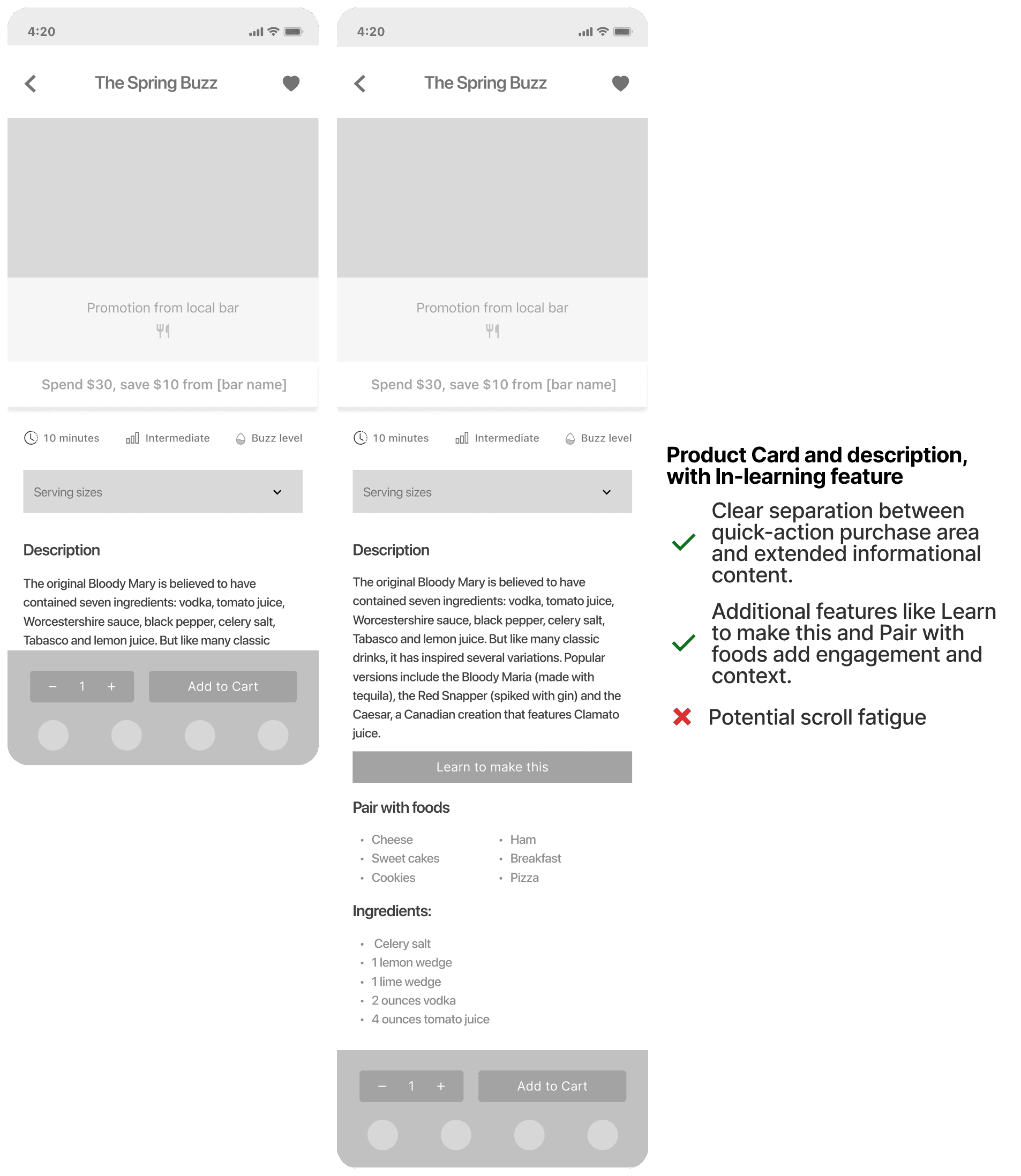
'Product Card' Page
The product detail view is the core interaction point for ordering, where we integrated both the option to purchase a drink and to learn how it’s made. Below is an exploration of these actions without cluttering the experience or distracting from the primary goal of conversion.
Product Card
Iteration & User Testing ———————
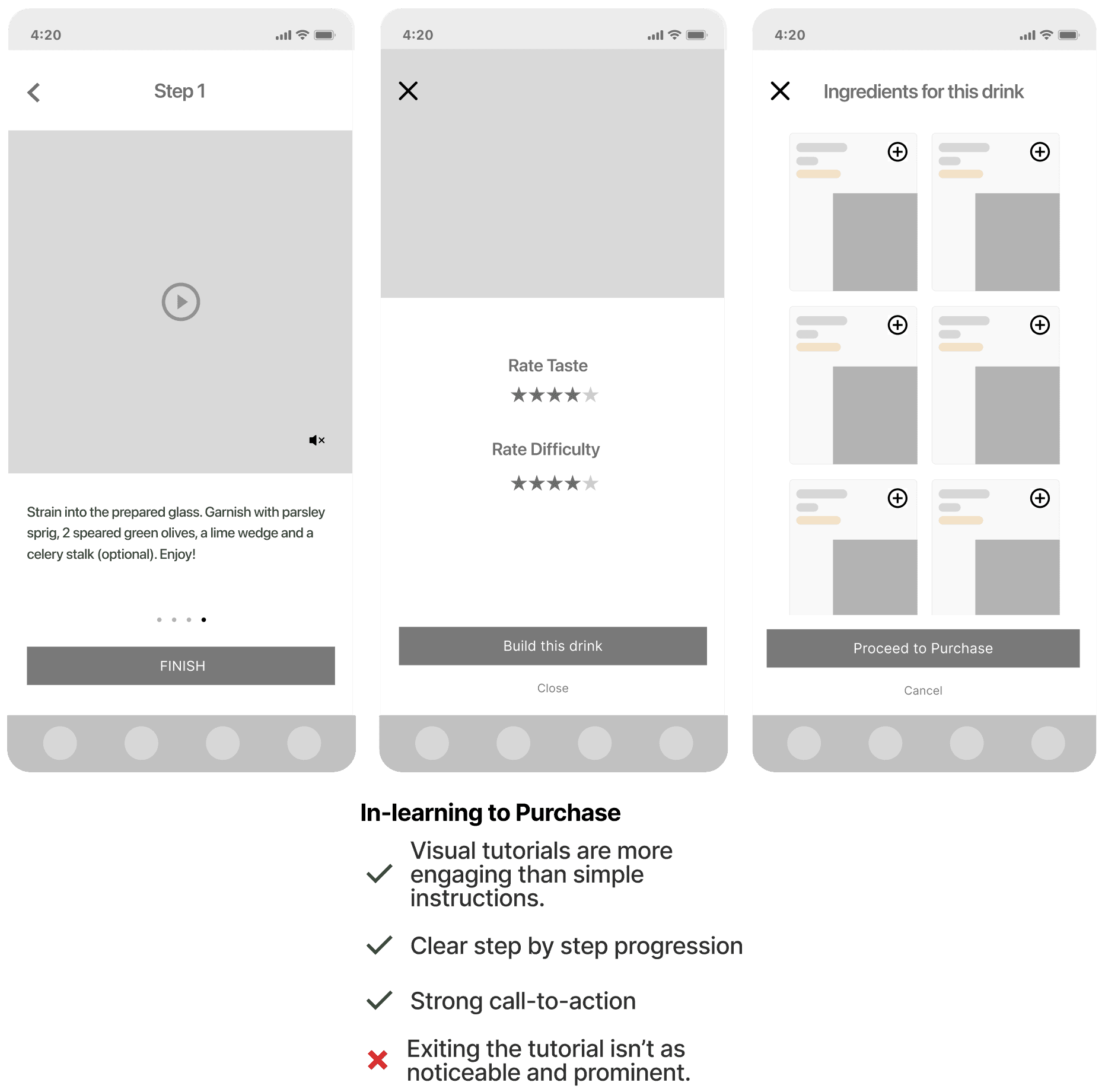
'In-Learning to Purchase' Page
The in-learning flow guides users through making a drink step-by-step, ending with an option to rate their experience. At completion, users can seamlessly transition from learning to action by building the drink through ordering its ingredients directly. This creates a smooth bridge between exploration and purchase, encouraging engagement while driving conversion.
In-Learning
Final Delivery ———————